Project:
Brand Identity
Client:
BSkyB
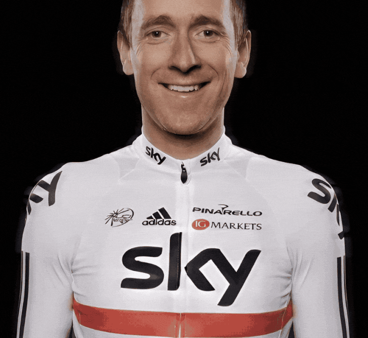
Team Sky was launched in January 2010. I worked closely with Sky and Team Management to create and evolve the Team Sky brand. While heading this project I got to work on a huge range of creative applications of branding, spanning all the media and touch points that an international sports team requires.
Central to both the philosophy and graphic identity of the Team Sky brand is ‘The Line’. This is a graphic representation of Dave Brailsford’s approach to coaching whereby every perceivable factor in the day-to-day routine of an athlete is scrutinised and then perfected in order to achieve marginal performance gains. These performance gains when added together are the difference between winning and losing, the line between good and great.
I got the oportunity to work closely with great brands like Adidas, Jaguar, Gatorade, Rapha, BSkyB, Pinarello, and Shimano to name a few.
Team sky has gone on to become an iconic brand in the cycling world, playing a huge role in inspiring more people to cycle.
Agency Credits:
Creative: Antidote London
Project:
Brand identity
Client:
British Olympic Association
The brief here was to update the identity system for the British Olympic Association.
The British Olympic Association needed a modern evolution of its identity system to take them up to and beyond the London 2012 Olympic Games. The identity system needed to comply with the strict rules of the IOC with regards to using the Olympic rings, as well as having the flexibility to span all the organisation’s subdivisions such as Team GB.
Agency Credits:
Creative: Antidote London
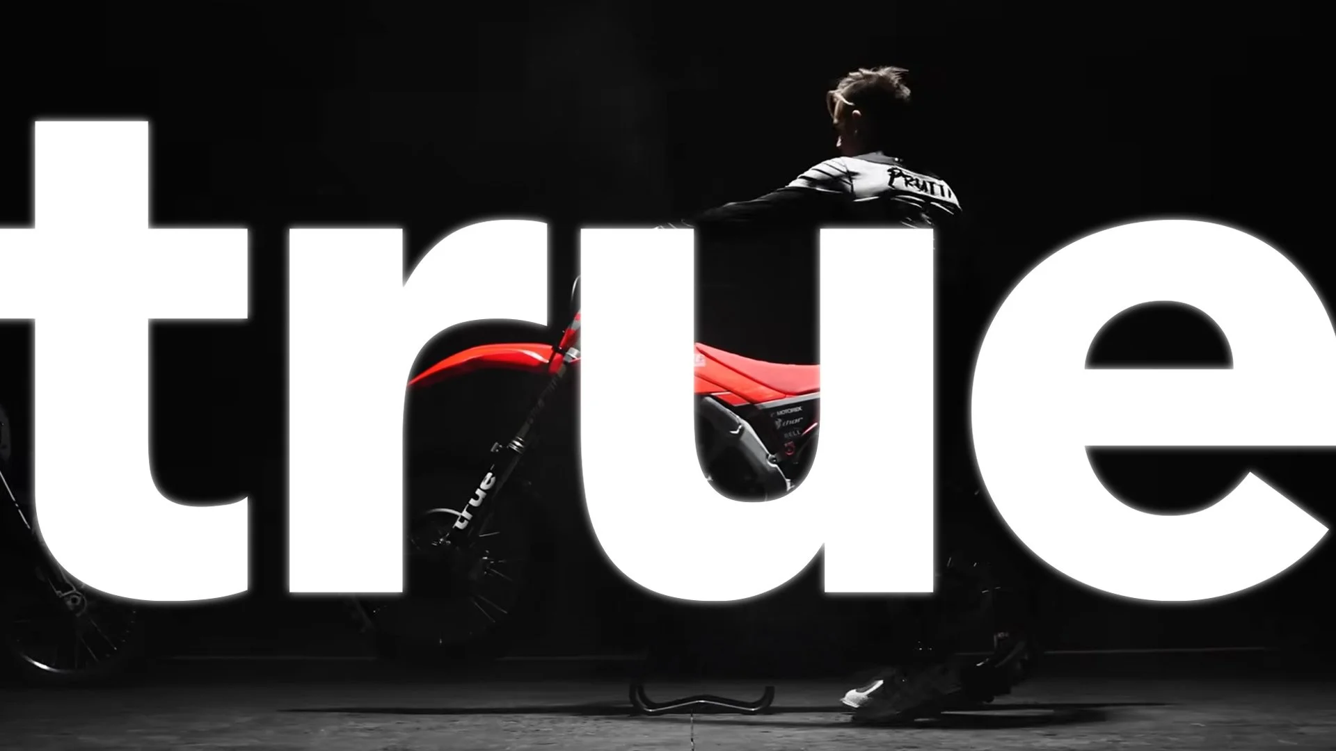
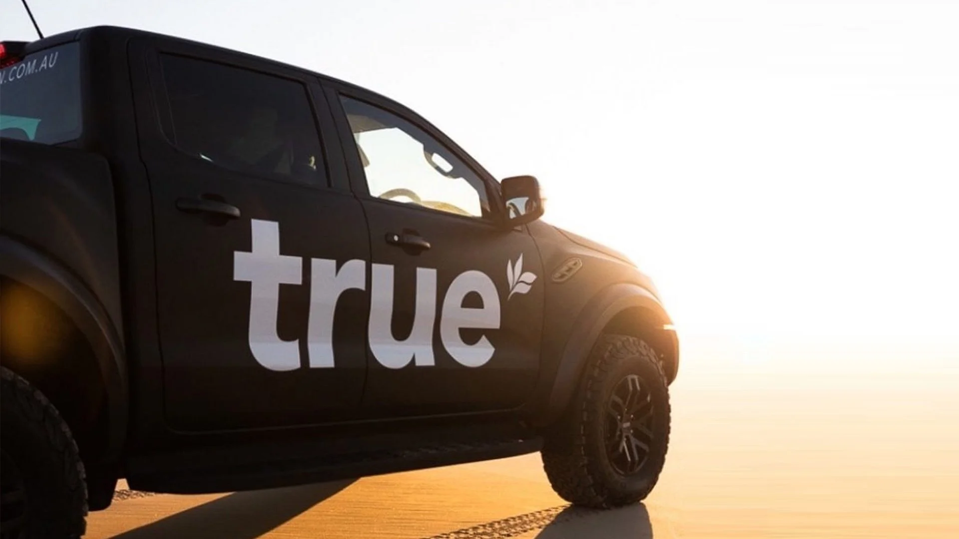
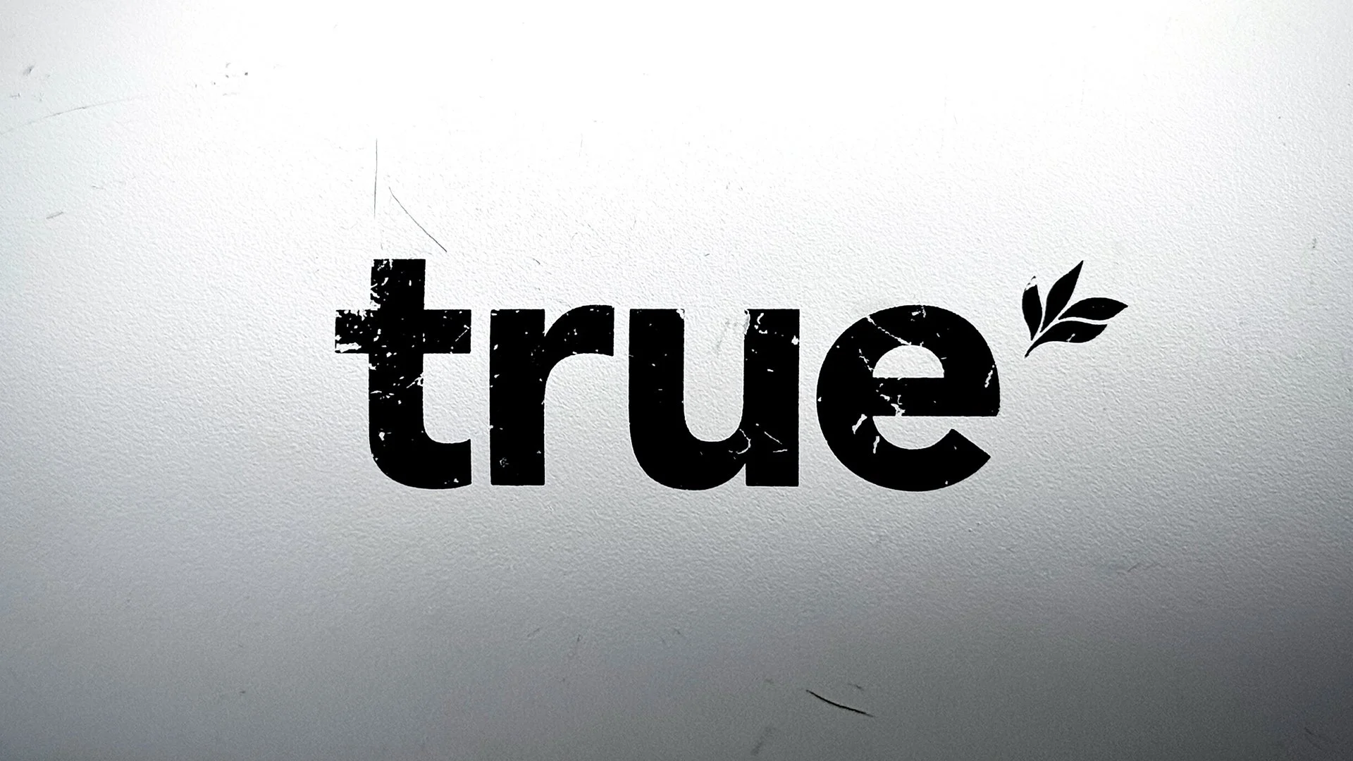
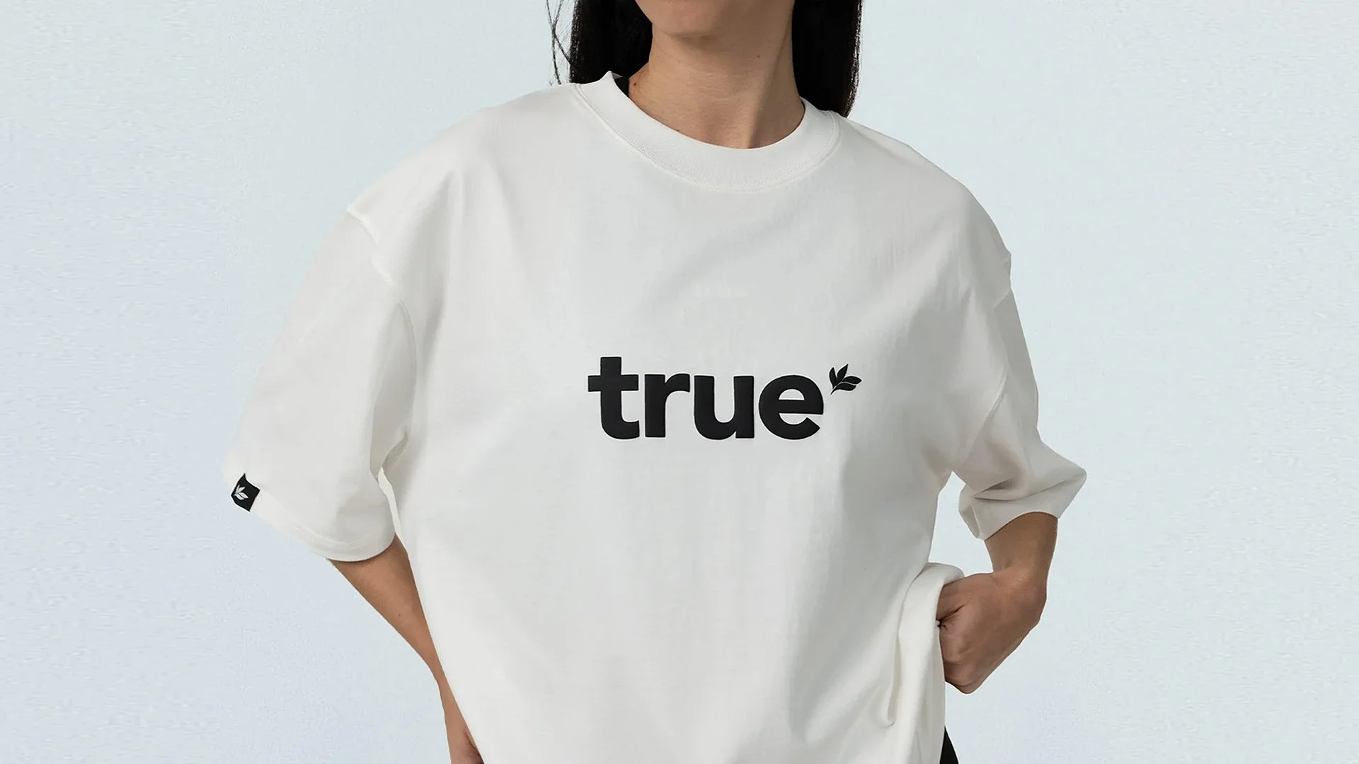
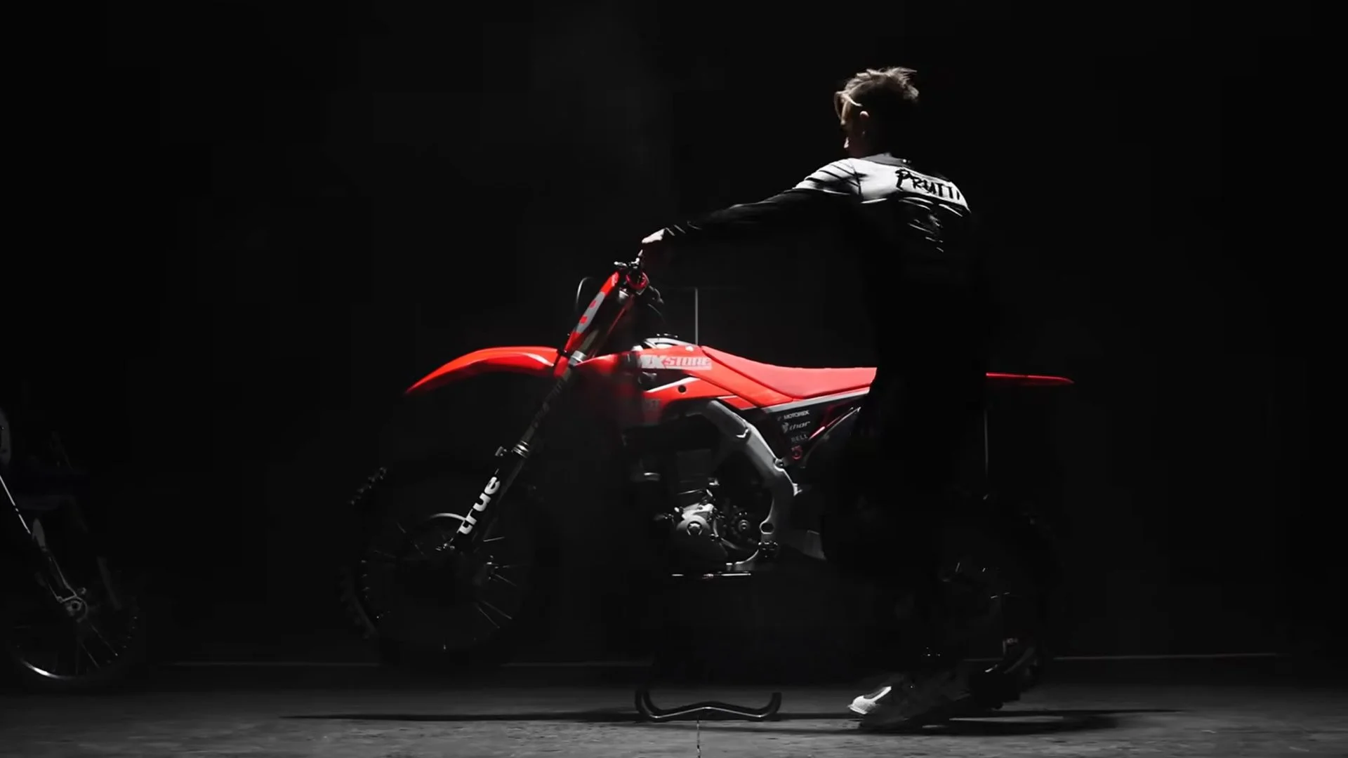
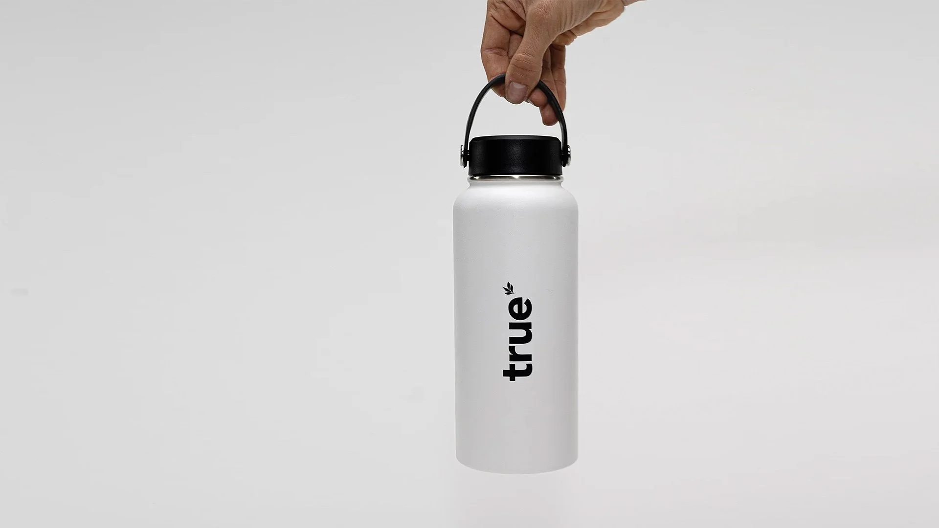
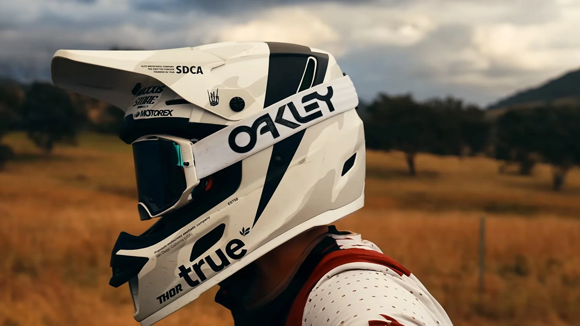
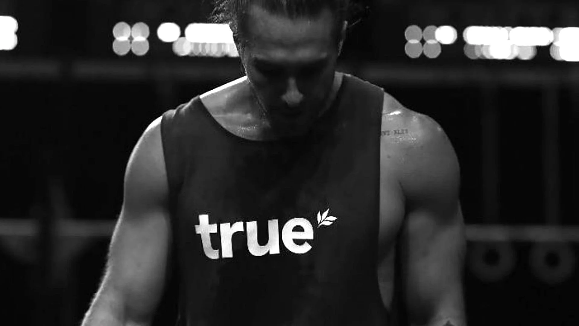
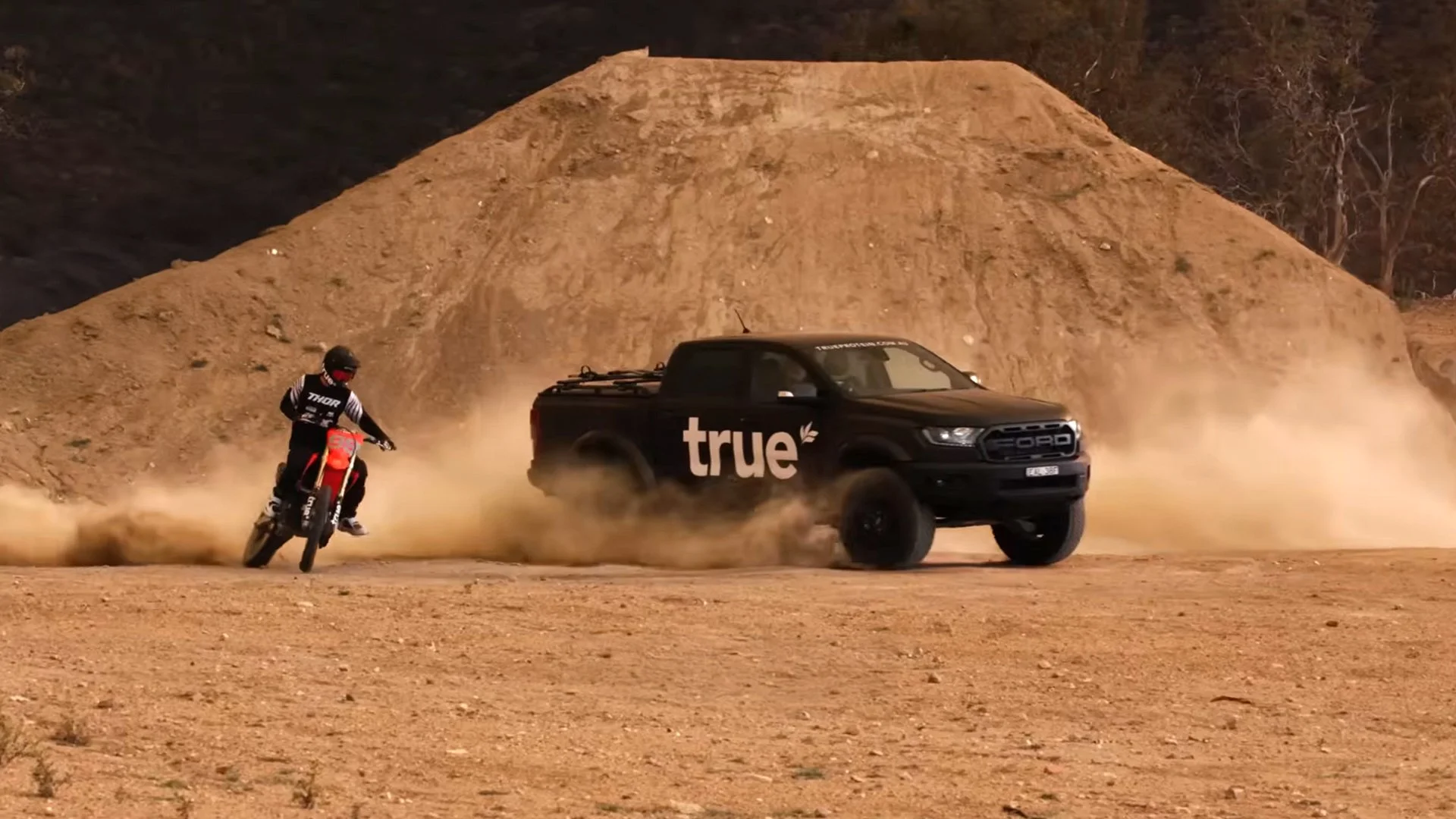
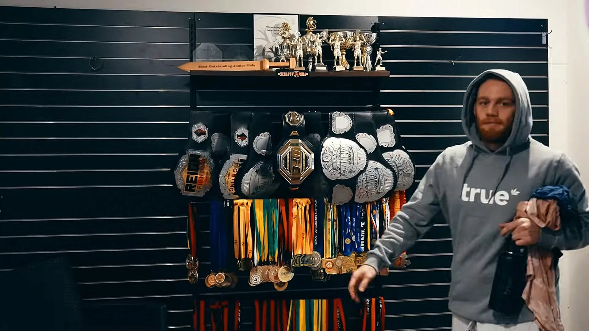
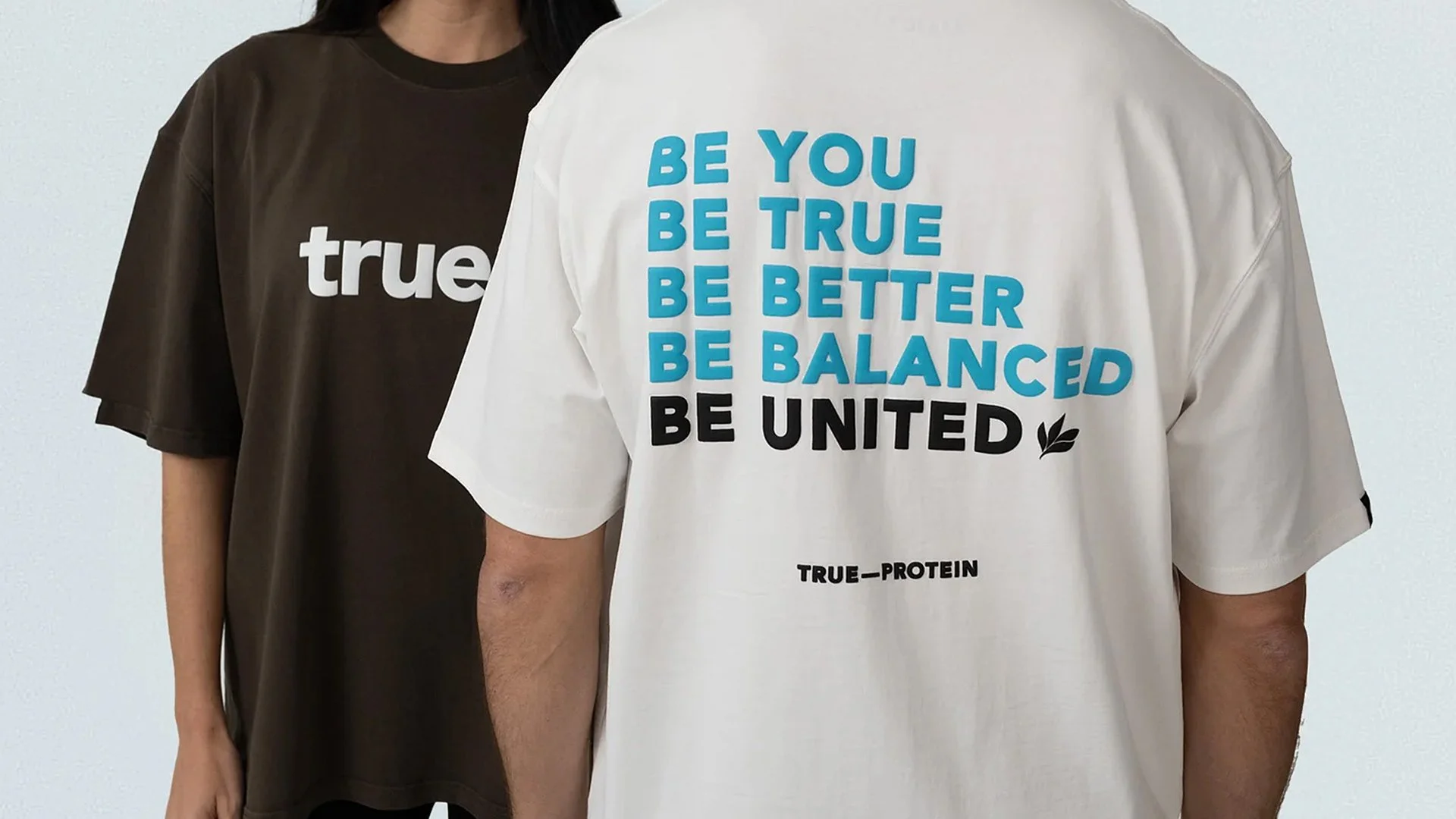
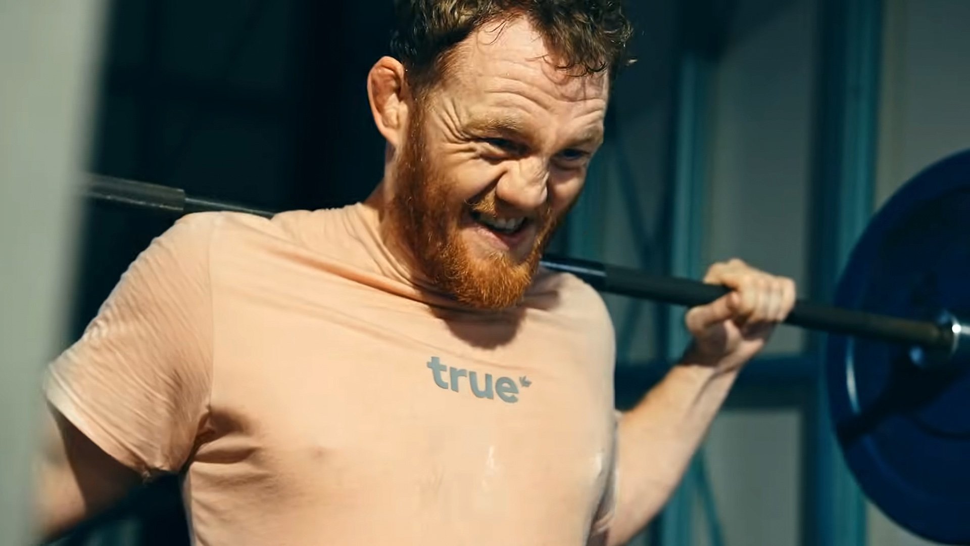
Project:
Brand Identity
Client:
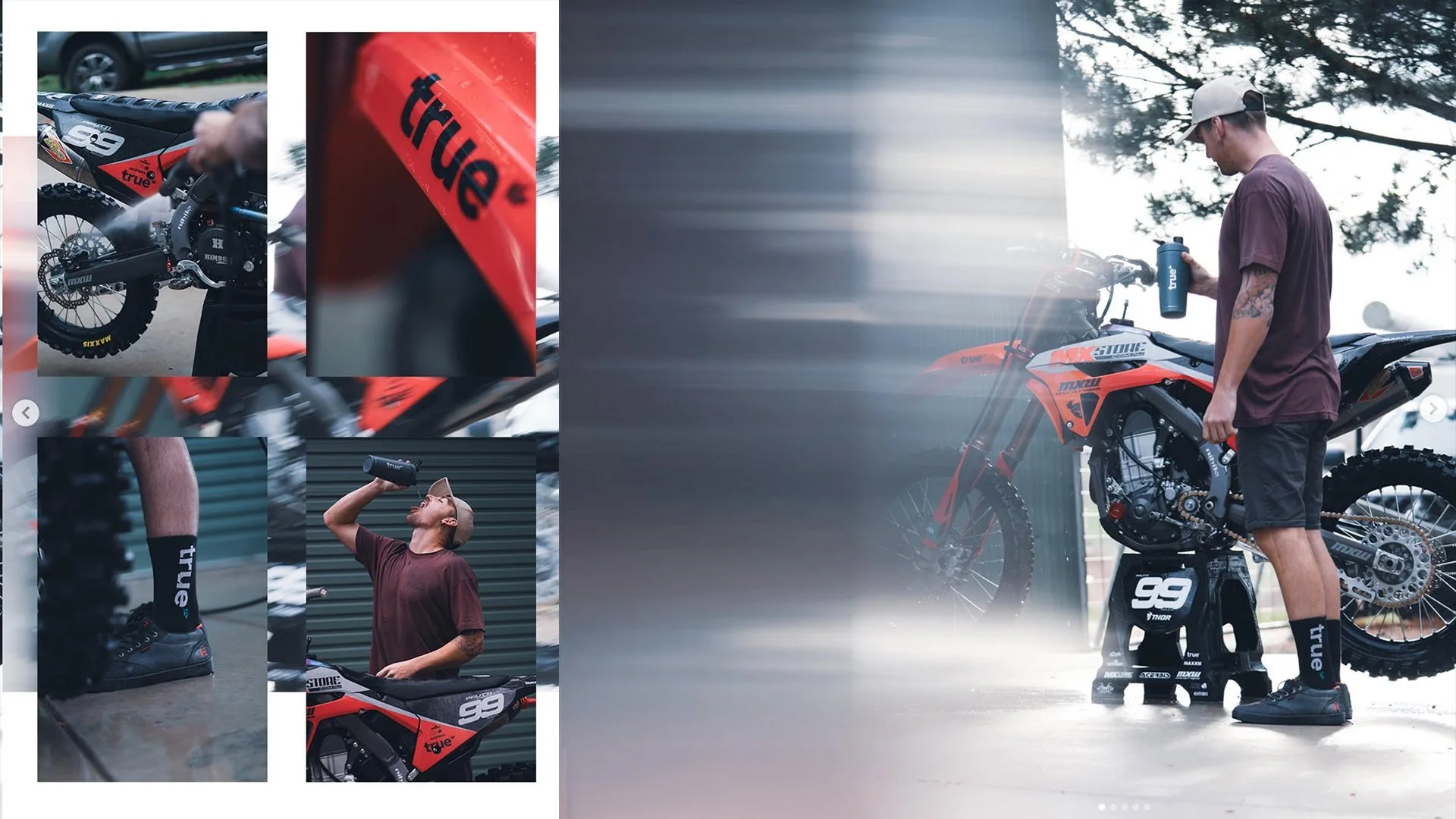
True Protein
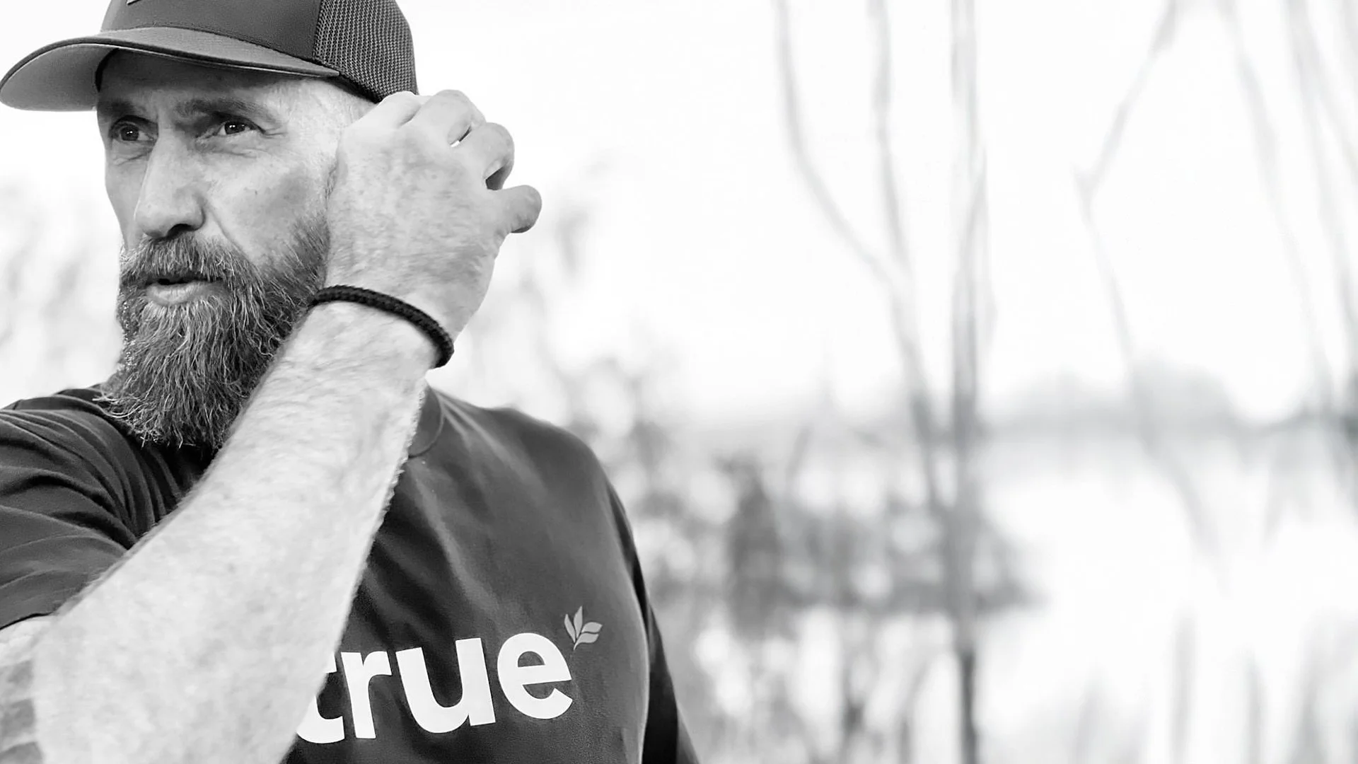
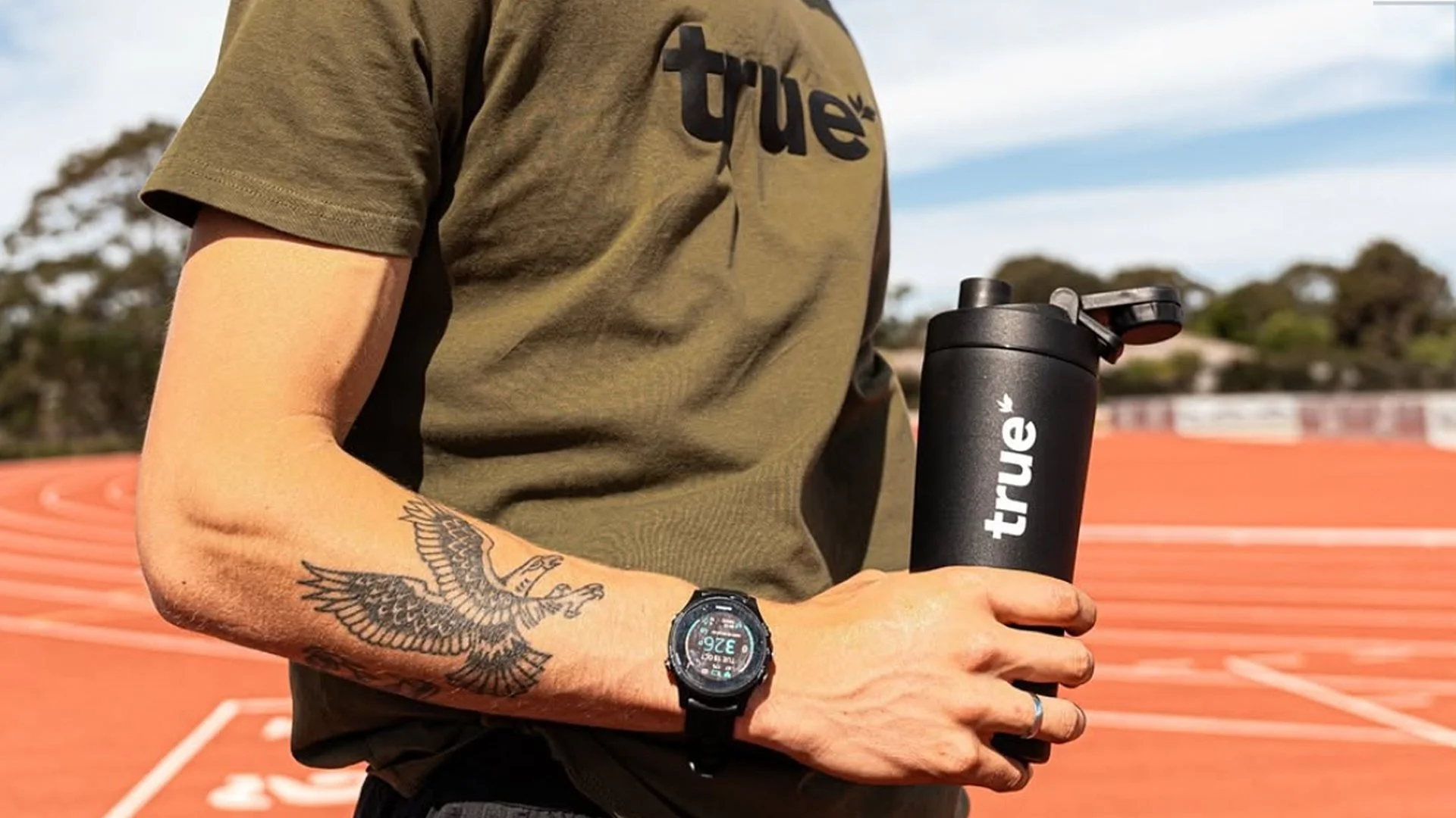
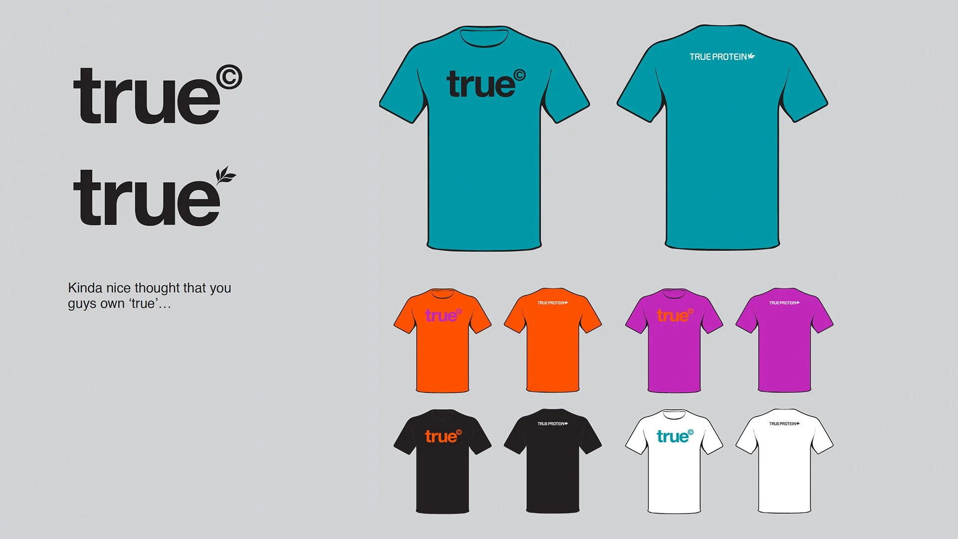
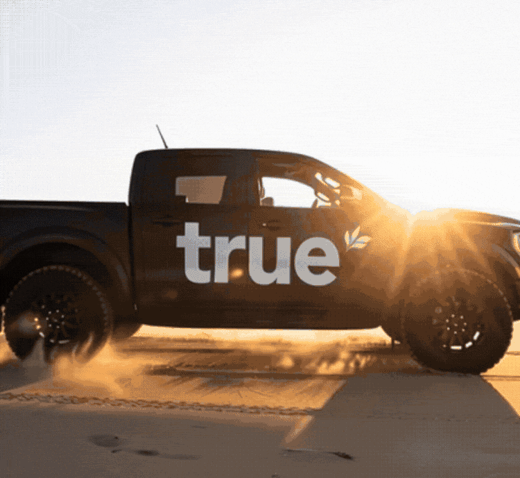
What started as a tee-shirt design brief, resulted in a full brand redesign.
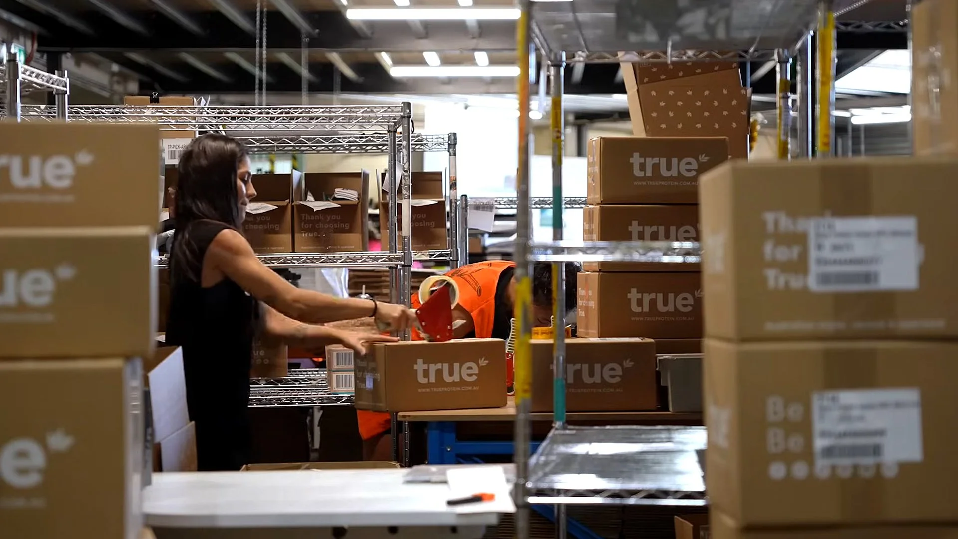
True Protein don’t just claim purity and quality, they bake it into every step of every single product they create.
They source premium ingredients globally, blend everything locally in their Sydney facility, and control every step of the production process. No fillers. No hidden sugars. Nothing artificial. Just transparent, high-performance nutrition that tastes good.
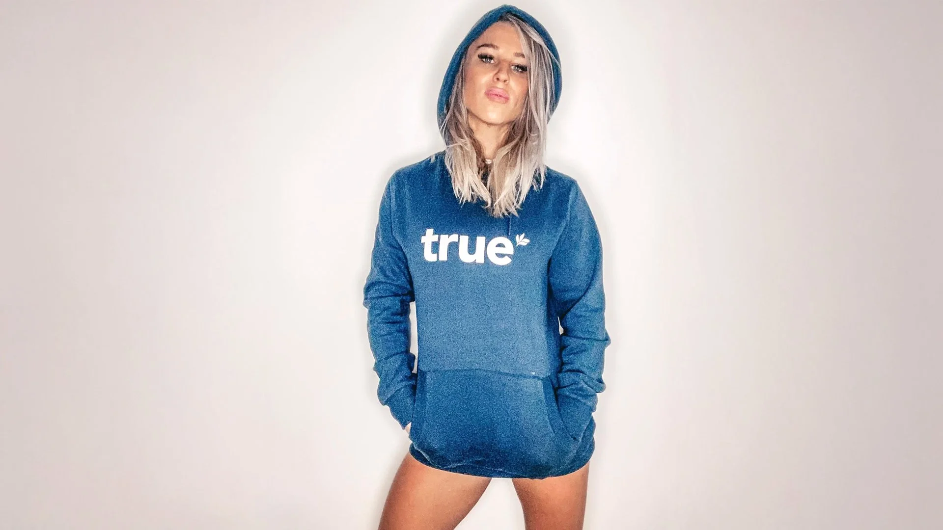
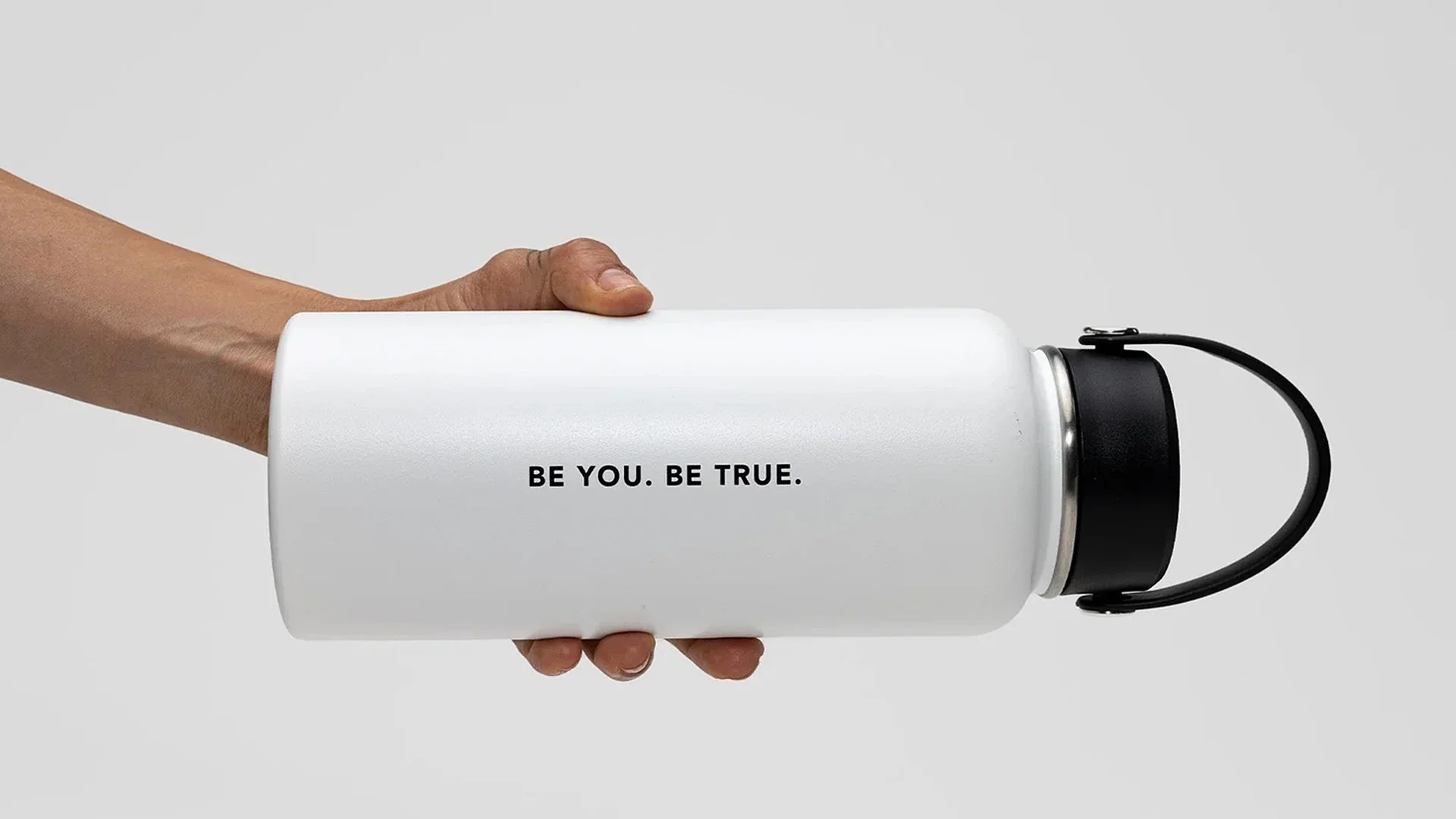
Back in 2014, I was briefed to design a limited run of athlete-only ambassador tees. While working on it, I had a thought on the business name for one of the designs. Why not reduce True Protein simply to True, and really own that powerful word?
Simplifying the name and creating a new logo for true instantly elevated the brand’s emotional value. It also unlocked flexibility well beyond protein and other sups; True Merch, True Events, True Athletes, True communities and more.
Most importantly, it helped create a more flexible platform for the future that founder Ben Kierath envisioned for the business. Big things in health, nutrition, lifestyle and wellbeing.
Big things they’ve gone onto achieve, dominating the market in every step.
For the last 10 years I have remained close to the brand, periodically consulting as a brand strategy & creative advisor.
Project:
Brand identity
Client:
Evans Cycles
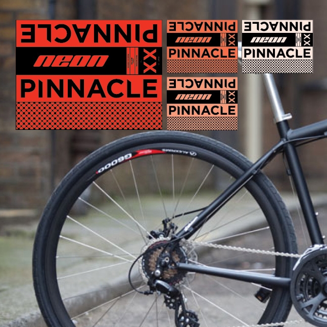
Pinnacle was a brand of bicycles which Evans had been trading for two years, but sales had been poor, prompting the need for a re-brand.
I created a new identity, the bike naming system, bike graphics, colour-ways, instore POS and website.
The new range naming system gave bikes names relating to their use and environment. Road bikes were named after types of stone, mountain bikes after species of wood, and hybrid/commuter bikes names came from elements on the periodic table.
Each frame had its own logo developed.
Each bike category is graphically represented by a pattern relating to its naming theme – wood for mountain, stone for road, and elements for hybrid and commuter bikes.
The bike graphics were applied in a unique way whereby all the frame information (model, size, material, make) was enclosed on a graphic wrap positioned on the down tube, leaving the rest of the frame clean and simple.
Agency Credits:
Creative: Antidote London
Project:
Brand identity & website
Client:
Fabric / Ogilvy & Mather
I created the brand identity, visual language, website and other promotional material to showcase Fabrics work and capabilities.
Agency Credits:
Creative: Fabric / Ogilvy & Mather
Project:
Brand identity
Client:
Evans
Evans wanted to create a new brand to be used to sell a range of cycling apparel, parts and tools.
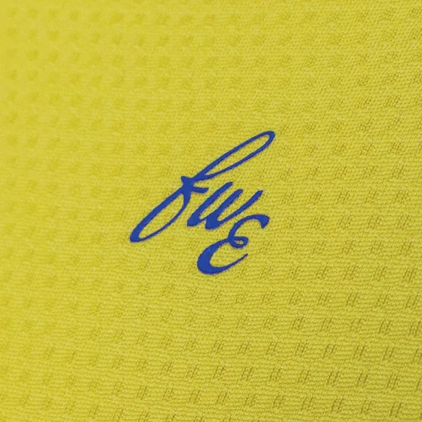
I came up with the name, brand identity and packaging design system. FWE stands for Frederick William Evans, the founder of Evans back in 1921. The approach to the identity and packaging was to reenforce the heritage and simple, functional quality Evans is known for.
FWE has been rolled out across 55 different products and is sold online and stocked in all Evans stores across the UK.
Agency Credits:
Creative: Antidote London
Project:
Identity & Website
Client:
Lee & myself
"LiversedgeWeir is a creative collective with the depth and reach of a full service design agency. We have no permanent studio or full-time staff. We don’t have a coffee machine, plasma screens, receptionists or personal assistants. We’ve been there, we’ve done that, and it just wasn’t us. Instead, we rely on the drive and experience of two creative people; ourselves – Lee and John.”
The identity and website was created to reinforce the simple premise of our business model – clean, simple, heroing the partners and letting the work speak for itself.
Agency Credits:
Creative: LiversedgeWeir
Project:
Personal Brand, PR & Earned, In-game Stunt
Client:
Kevin Pietersen
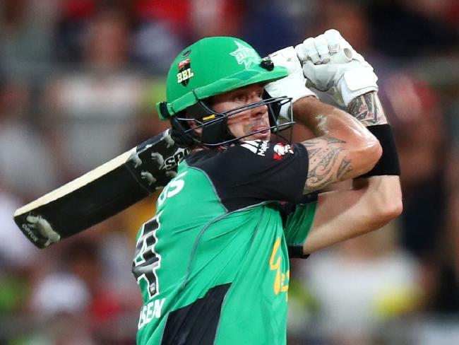
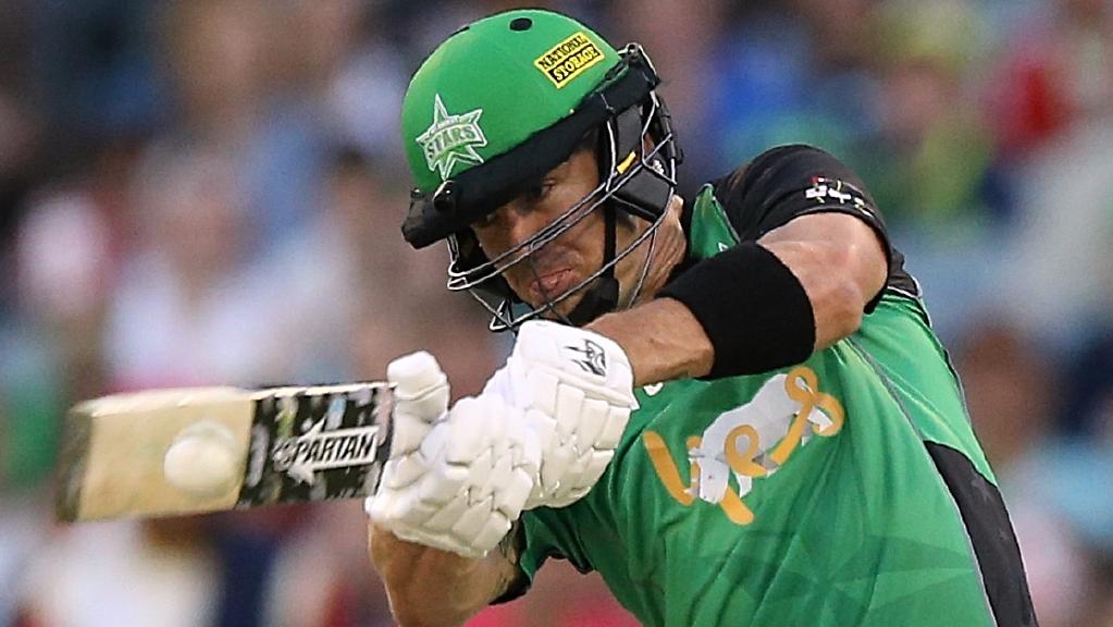
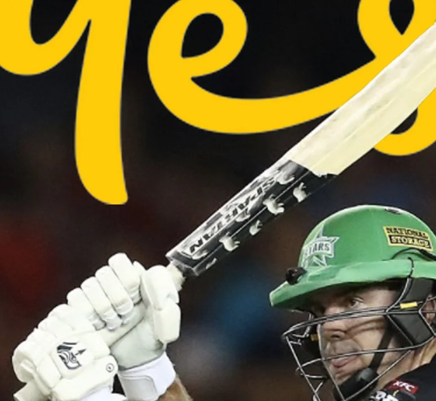
Kevin Pietersen is arguably of the most prolific batsmen to play the game of Cricket, however not necessarily loved in Australia.
Whilst a lot of conversation is driven by the rivalry he has with Australia, it has been show that when given the opportunity, Kevin shows another side to himself, and this human side resonates in particular with Australian audiences. Actions speak volumes.
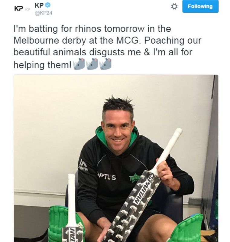
This opportunity translated into a rebrand of Kevin Peterson, switching the conversation to the numerous initiatives Kevin has put his efforts towards and, as a result, achieved great things. We called this 'The KP Effect'
The idea being that through The KP Effect we provide a platform for Kevin Pietersen to be able to have others shout about who he is and what he does. We are going to provide Aussie fans more reasons to share the bright side of KP.
Kevin's un-sung initiatives include he is passionate and effective conservationist, he runs the KP24 foundation (helping disadvantaged youth around the world), and he does lots of great work for OcuMel (ocular cancer charity).
The first manifestation of the KP Effect was, through using a clever interpretation of the ICC's bat branding rules we enabled Kevin to use his platform in the Big Bash League to elevate his passionate concerns for Rhino Conservation in Africa.
To do this we actually had to parter with Spartan to create a custom Rhino bat, made available for purchase, to navigate in-game bat branding restrictions.
The result was a brilliant Rhino conservation awareness campaign that crescendoed in the final games of the season, where a children's bat design competition got huge participation and media coverage.
The net result was a mass of positive sentiment online for Kevin Pietersen in Australia and world wide.
Agency Credits:
Creative: Octagon
Social: We Are Social
Project:
Magazine design
Client:
Ausfilm
Ausfilm annually produces a directory to showcase their members services and capabilities to a global audience.
We redesigned the members directory, repositioning it as a high end 48 page publication that contains commissioned articles and interviews with local studios (and Platinum Members) Fox, Animal Logic, Rising Sun Pictures and Iloura.
Agency Credits:
Creative: LiversedgeWeir
Project:
Re-brand
Client:
Ausfilm
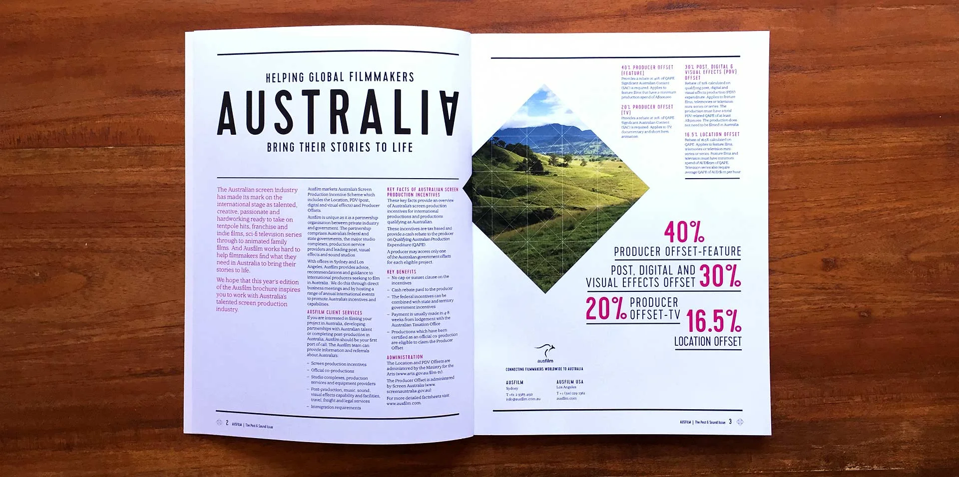
Ausfilm connects the global film community with Australia’s screen incentives, locations, talent and facilities. We were engaged to audit and review the Ausfilm brand and all associated collateral, with the ambition to reposition the business and raise awareness of the depth of Australia’s incentives, innovative and creative screen talent, three studio complexes, diverse locations and big budget production experience.
While retaining the original brand mark, we redefined the visual language across all print, digital and physical creative platforms.
The visual language was made up from a dynamic grid, allowing multiple variations of layout and image combinations, suiting the many different content types and messages Ausfilm often needs to convey.
Agency Credits:
Creative: LiversedgeWeir
Project:
Short film competition
Client:
Singtel
To promote a Singtel global 5minute film competition, we created a campaign, using actor Samuel Johnson.
We named the competition Connect5 – 5 minute films about connecting lives.
Our way in was to have fun with how short a 5 minute film is, with Samuel missing a screening only to make the credits. The film was released online and on social media.
The campaign also included a website, posters and promotional popcorn.
Project:
Brand identity
Client:
Luxury Beverage Group / Bootleggers
Bootleggers is an alcoholic beverage supplier that sources boutique fine wines and spirits from around the world.
Bootleggers began as a collaboration between Peter and Ben Hasko, and Champagne Henriot. Just as bootleggers smuggled Champagne into Americaduring the period of prohibition in the 1920s, Peter and Ben go the extra mile to source the upmost quality and rare products from all over the world, and get them to the people.
We built the brand positioning and delivered all touch points from brand mark and stationery, through to guidelines and website.
Agency Credits:
Creative: Fabric / Olgivy & Mather
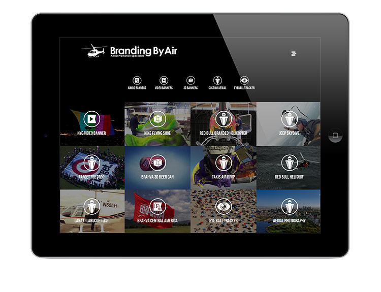
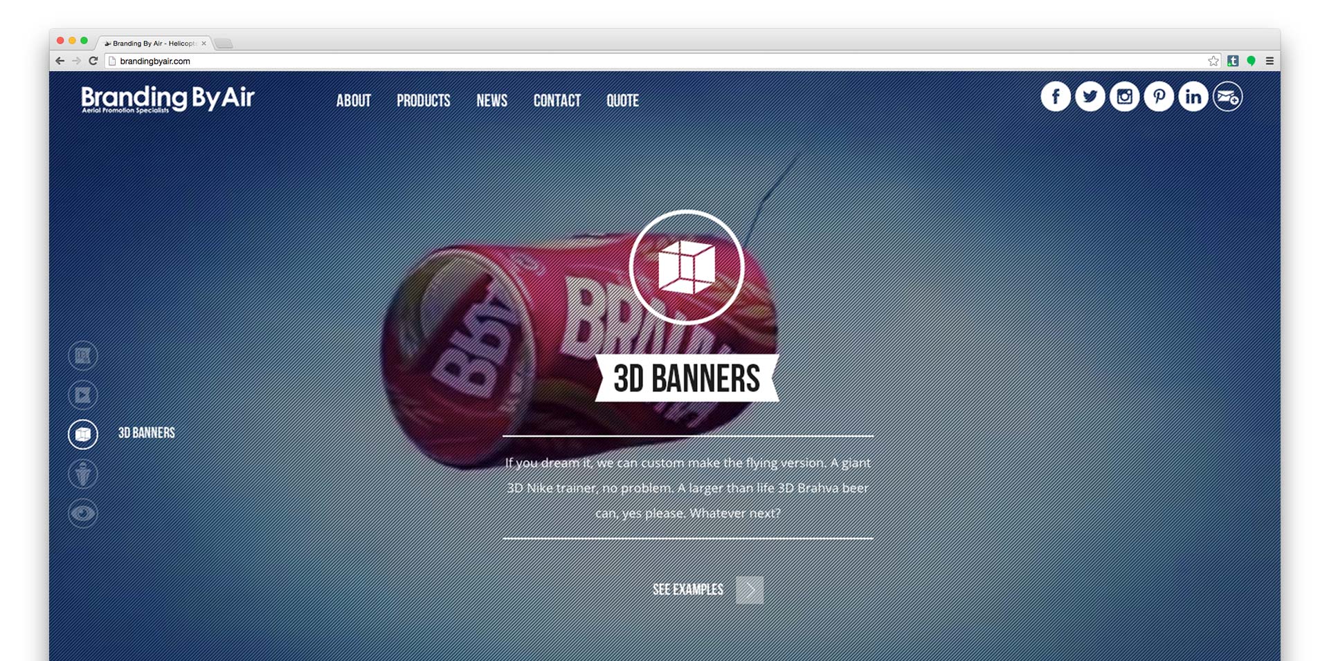
Project:
Website & Brand Positioning
Client:
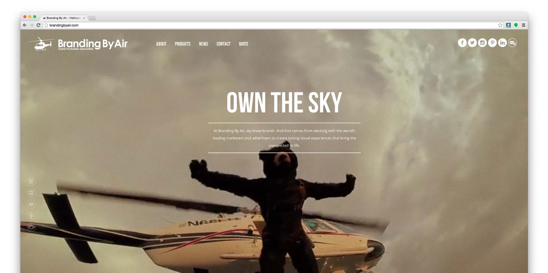
Branding By Air
Branding By Air are a global business specialising in aerial promotion. They needed to communicate all the fantastic things they had done, and more importantly all the things they can do.
We started by changing the way they talk about themselves, and the products they had.
This translated into a totally new visual language usingproduct icons, engaging full-screen imagery and video, and a new bold proposition: ‘Own The Sky’.
Agency Credits:
Creative: LiversedgeWeir
Project:
Book Design
Client:
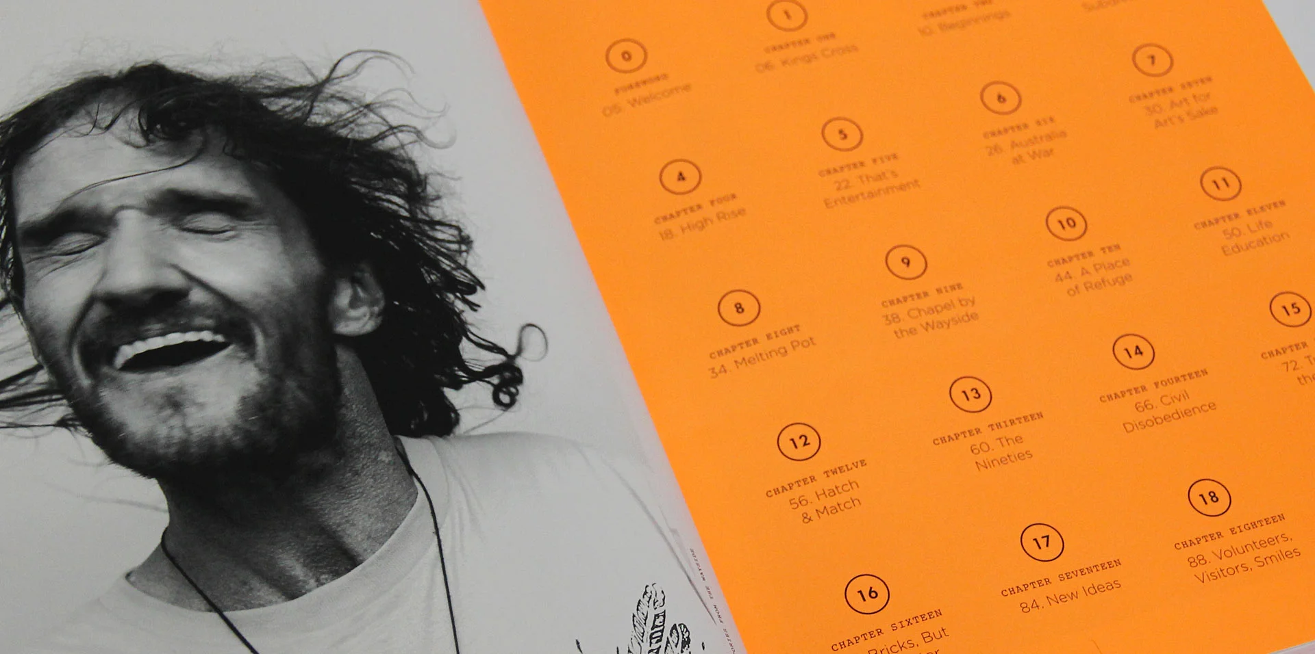
Wayside Chapel
The Wayside Chapel is a famous charity in Kings Cross Sydney, existing to help those in need in the surrounding community.
To commemorate their 50th anniversary we created a book, which would go on to become a powerful fundraising tool at subsequent events.
The book idea was 50 years looking back and 50 years looking forward.
The author Ron Ringer wrote the book as a formal documentation of Kings Cross and its colourful history, but importantly the role that the Wayside Chapel has played over the last 50 years.
To give this book a little bit of intrigue we used 804c fluro special throughout – which brought to life what was otherwise a clean grid and design.
Agency Credits:
Creative: Fabric / Olgivy & Mather
Project:
Website
Client:
Tight Knickers
This was my first ever paid job, done as freelance work while at Enmore Design College 2003. It ending up winning a Silver Pencil beating Nike, and in the many hours spent making it I learned how to action script in Flash – also learned that you only make good things if you spend waaaaay to much time on them.
Agency Credits:
Creative: Me.